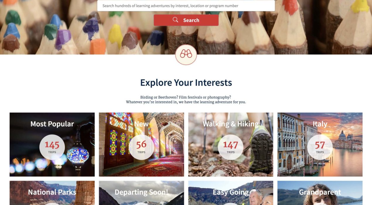

Road Scholar Home Page Redesign
Road Scholar noticed that their home page user engagement was dropping off over time, causing sales to decline. They asked the Moth team to help remedy this dire situation. Using heatmap data and site analytics, we constructed some content strategies to rearrange the home page and add more relevant user content to it. Using elements from their design system, we restructured the home page so that more browsable components were brought higher up in the experience. We also introduced some entry points to their travel blog and other frequently generated content. The order of the page elements varies based on the user’s data, surfacing more relevant content for that person. Immediately after our efforts were implemented, Road Scholar’s site engagement took off, and sales increased dramatically. Original Home Page Updated Home Page
Read More ›
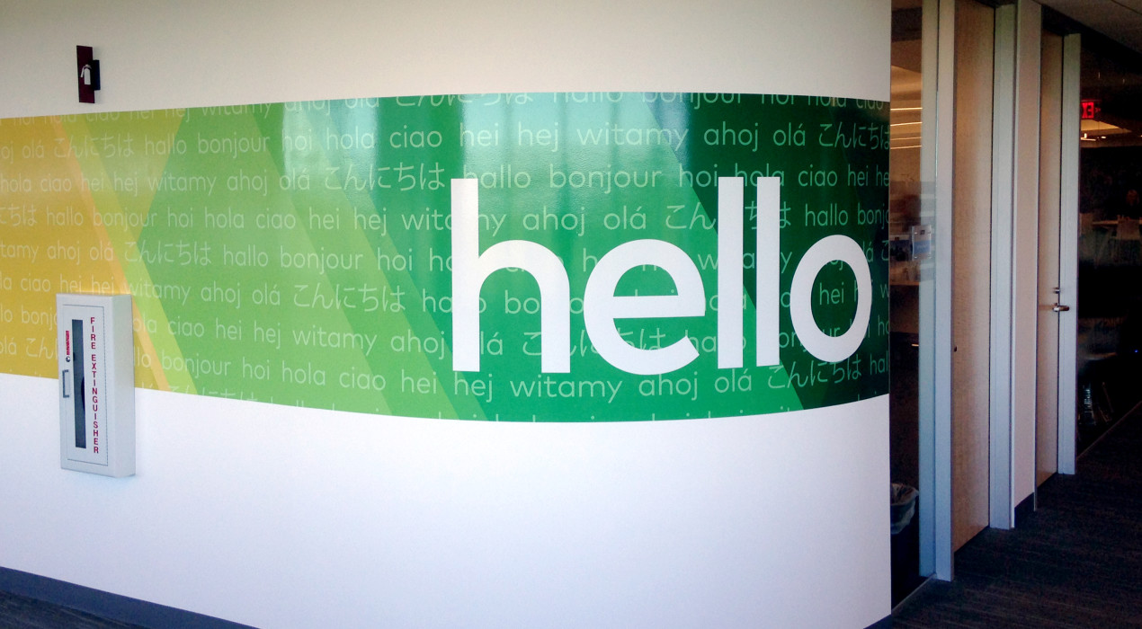
Vistaprint Wall Decor
After outgrowing its original location and moving to a new complex, Vistaprint had a desire to incorporate its recently rebranded visual identity into the new building. They wanted it to be completed in time for the company’s first phase of transition, which was a mere three weeks from the project kickoff. I worked closely with the whole creative team , each of us pitching in suggestions and ideas to create what ultimately became the full experience — a continuous band of the branding pattern that transitions to each of Vistaprint’s colors, interspersed with photography and messages that carry across the theme of identifying the uniqueness and vastness of the customer base.
Read More ›
Vistaprint Interactive Kiosk
As art director at Vistaprint, I was tasked with envisioning the design for an interactive welcome kiosk. The kiosk serves as a fun educational tool that allows employees and visitors to access information and announcements, and is a unique opportunity to immerse the user in Vistaprint company culture.
Read More ›
MassMutual Take 5 Video Storyboards
MassMutual recognized that there was a gap in the understanding of many common financial challenges amongst its customer base. The Take 5 video initiative was created to educate MassMutual’s customers about these challenges and prompts them to contact an agent to learn more. I helped conceptualize and develop the storyboards for the videos, utilizing an iconographic, illustrative style to convey stories of Your Most Valuable Asset, Your Value as a Provider, Outliving Your Retirement Income and Lifetime Economic Value.
Read More ›
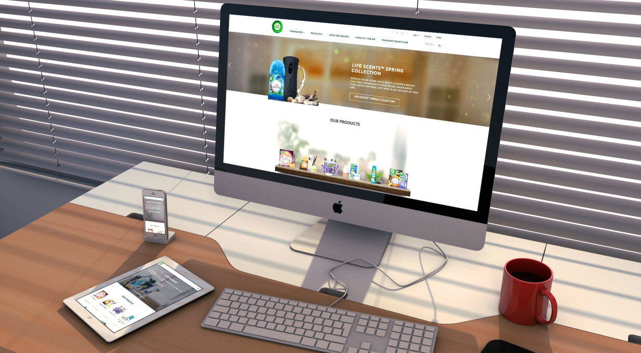
Airwick Website Redesign
Airwick was looking to transform their basic brand site into a refreshing, constantly updated platform that engages consumers that are busy and on the go. The site was designed with mobile in mind, utilizing only the essentials and allowing for an experience that is accessible and consistent across all platforms. The design also had to adhere to a strict UX framework and highly prescriptive branding guidelines. This created the challenge of transforming a rigid construct into a beautiful, fluid design.
Read More ›