

Shorelight University Portal Application
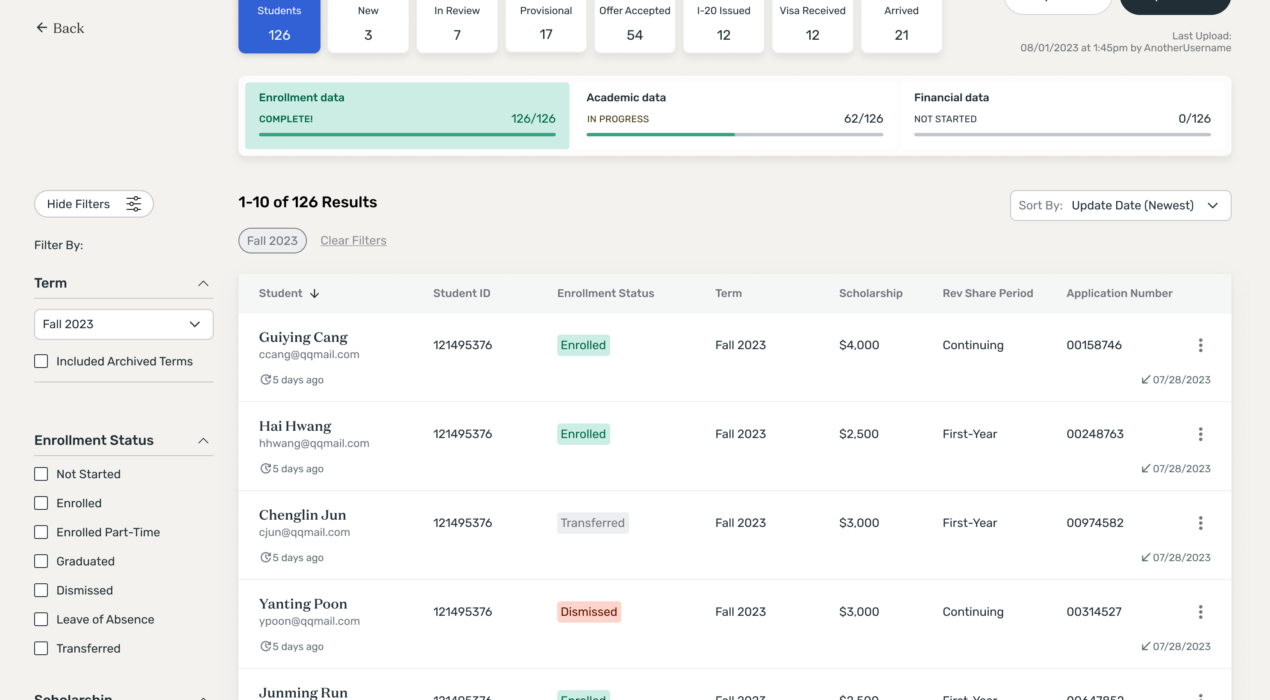
Shorelight partners with U.S. universities to create programs that support international students, providing services to help them succeed academically and advance in their careers. A significant challenge we had with our university partnerships was maintaining data integrity — universities needed clear visibility into how well prospective students were progressing toward meeting U.S. enrollment requirements, while Shorelight required accurate tracking of each student’s academic progress post-enrollment. Shorelight’s financial success is tied to students’ academic progress, therefore accurate tracking is crucial for proper billing. Another major data challenge Shorelight encountered was ensuring the integrity of university program information. With over a hundred partner universities, each offering multiple degree levels and unique program requirements, costs, deadlines, and other details, it was challenging to keep university program data consistently aligned with Shorelight’s records. This often led to discrepancies on the consumer side, where students sometimes received inaccurate or conflicting information about a program they were interested in. When I joined Shorelight, I was focused on designing interfaces for our students and education agents and hadn’t yet had the chance to work directly with our university partners. This presented an exciting challenge—a chance to design for a new audience while tackling these important issues for […]
Read More ›
Osteonovus Website: Design & Development
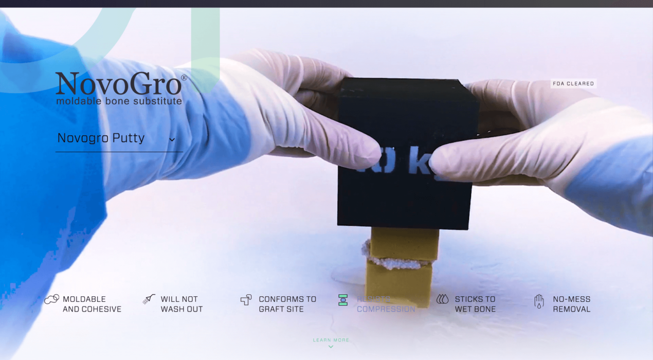
Ostenovus wanted to introduce their new product line of bone regenerating putties with a quick, but informative interactive experience. We achieved this by shooting demonstration videos that show how strong and versatile the products are under several common surgical procedures. We also provided users with a way to examine how the product affects bone growth over time, at several magnification levels.
Read More ›
Vistaprint Wall Decor
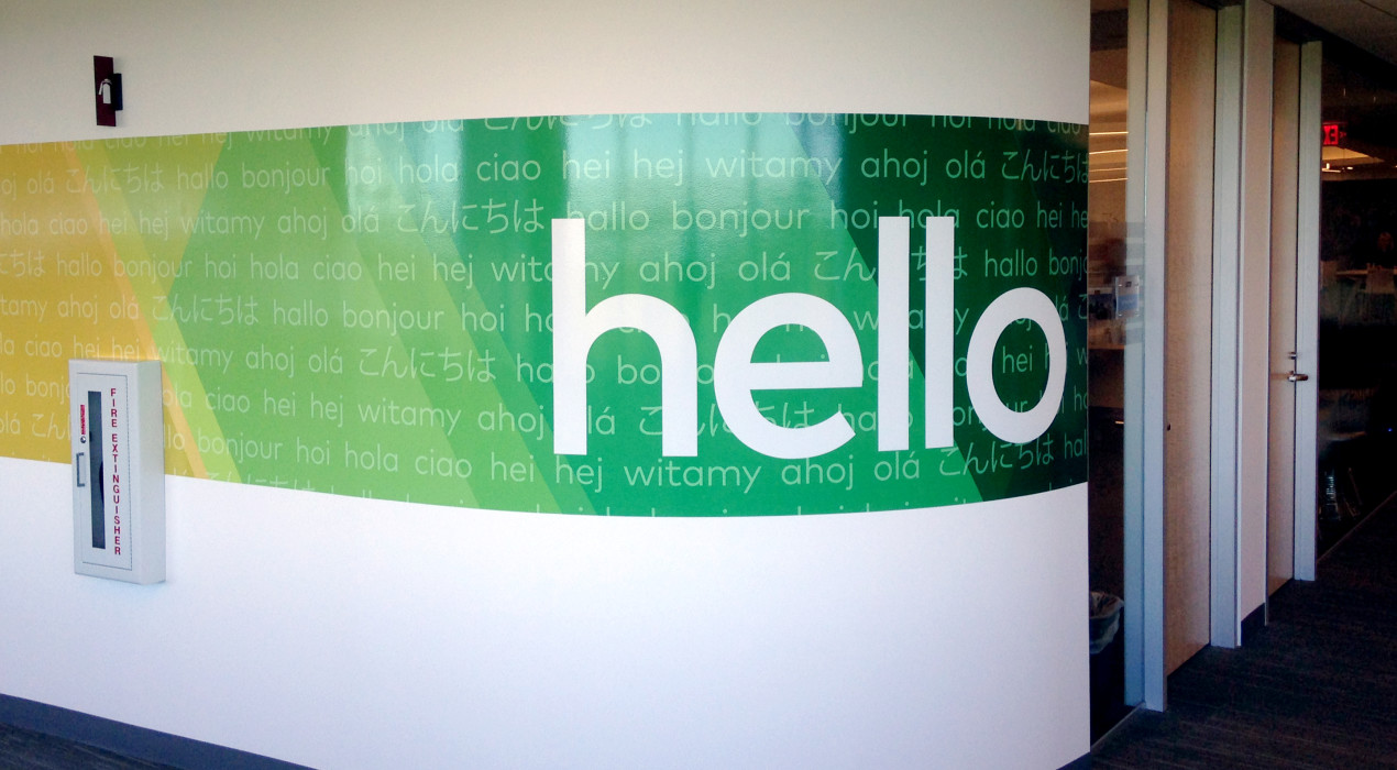
After outgrowing its original location and moving to a new complex, Vistaprint had a desire to incorporate its recently rebranded visual identity into the new building. They wanted it to be completed in time for the company’s first phase of transition, which was a mere three weeks from the project kickoff. I worked closely with the whole creative team , each of us pitching in suggestions and ideas to create what ultimately became the full experience — a continuous band of the branding pattern that transitions to each of Vistaprint’s colors, interspersed with photography and messages that carry across the theme of identifying the uniqueness and vastness of the customer base.
Read More ›
Vistaprint Interactive Kiosk
As art director at Vistaprint, I was tasked with envisioning the design for an interactive welcome kiosk. The kiosk serves as a fun educational tool that allows employees and visitors to access information and announcements, and is a unique opportunity to immerse the user in Vistaprint company culture.
Read More ›
Why Digital Guardian? Video Storyboard
Digital Guardian was in need of a tool to educate their customers about their brand reinvention and how its endpoint security technology is the best way to protect sensitive data. I helped ideate the initial concept and designed a storyboard for the video, utilizing the new site aesthetics and a flat, icon-based approach.
Read More ›
