
Lesley University Redesign
Prospective students were having difficulty locating information on the Lesley University website. After a complete content overhaul and restructuring of course information, we designed a site that quickly allows students to find the course info they’re looking for. The site was designed with a mobile-first approach to cater to the prospective student audience. The other major aspect of the site redesign was showing how Lesley is centered around its community and their stories.
Read More ›

MIT CSAIL Website UX
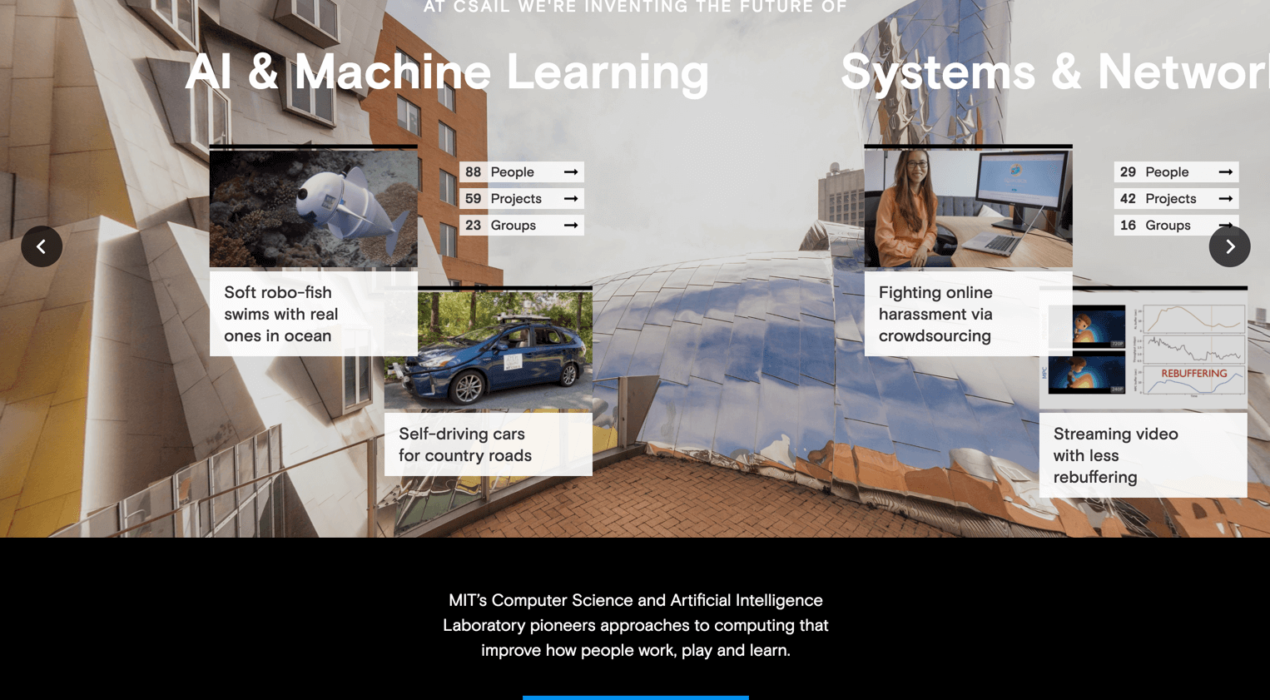
At CSAIL (MIT’s Computer Science and Artificial Intelligence Laboratory), students were having difficulty locating the professors they wanted to work with, or the groups and projects they wanted to join. There was no easy way to sort through the different categories of interests and impact areas on the old site, and most of the detailed CSAIL information was interspersed among several external research group websites. The old site also didn’t demonstrate the culture interconnectivity at CSAIL, and it didn’t effectively educate users about the organization. We conducted user interviews with students and professors, asking about the general pain points throughout the site and in the CSAIL application process. We also examined site analytics to see where users were going and where they were dropping off. We used this combined data to restructure the site, introduce connectivity and add more useful information for the CSAIL student. We created a system to organize all of CSAIL (people, research projects, research groups, news and events) and allow a user to find things relevant to their area of study. Profile pages for each person, group and project have information that shows how all of CSAIL is connected. We also created a section that explains […]
Read More ›
Road Scholar Home Page Redesign
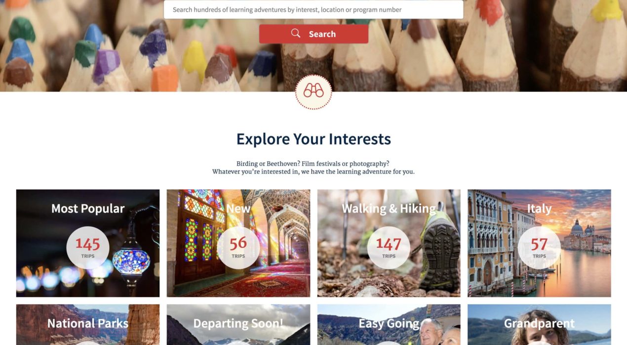
Road Scholar noticed that their home page user engagement was dropping off over time, causing sales to decline. They asked the Moth team to help remedy this dire situation. Using heatmap data and site analytics, we constructed some content strategies to rearrange the home page and add more relevant user content to it. Using elements from their design system, we restructured the home page so that more browsable components were brought higher up in the experience. We also introduced some entry points to their travel blog and other frequently generated content. The order of the page elements varies based on the user’s data, surfacing more relevant content for that person. Immediately after our efforts were implemented, Road Scholar’s site engagement took off, and sales increased dramatically. Original Home Page Updated Home Page
Read More ›
Harvard Business School Campaign Site Design
Harvard Business School was seeking to develop a campaign section for its Alumni site, with the goal of funding its global programs and educating the public about the impact of HBS. I helped develop a rich experience that walks users through the case for HBS and compels them to support the campaign initiative. The bold and engaging elements of the site push the user to further explore the content and learn about the innovation, research and societal enrichment that HBS provides.
Read More ›
Harvard Business School Interactive Pitch Book Design
As a companion piece to the HBS Alumi Campaign site, I helped develop digital pitch book brochures that further explore the details of the HBS Campaign. The pitch books were designed so that an HBS representative can quickly present information to potential donors. The experience is optimized to work on across multiple platforms, ensuring that it can be accessed on the go, from any device.
Read More ›

