

MIT CSAIL Website UX
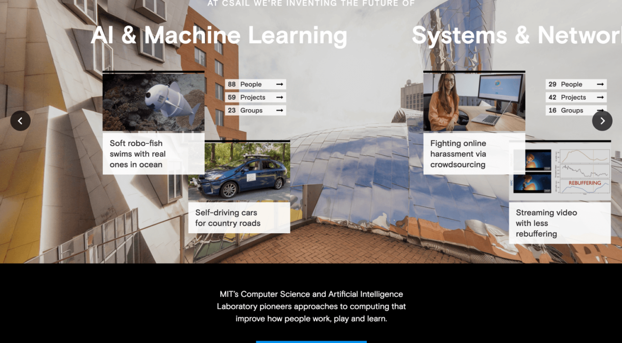
At CSAIL (MIT’s Computer Science and Artificial Intelligence Laboratory), students were having difficulty locating the professors they wanted to work with, or the groups and projects they wanted to join. There was no easy way to sort through the different categories of interests and impact areas on the old site, and most of the detailed CSAIL information was interspersed among several external research group websites. The old site also didn’t demonstrate the culture interconnectivity at CSAIL, and it didn’t effectively educate users about the organization. We conducted user interviews with students and professors, asking about the general pain points throughout the site and in the CSAIL application process. We also examined site analytics to see where users were going and where they were dropping off. We used this combined data to restructure the site, introduce connectivity and add more useful information for the CSAIL student. We created a system to organize all of CSAIL (people, research projects, research groups, news and events) and allow a user to find things relevant to their area of study. Profile pages for each person, group and project have information that shows how all of CSAIL is connected. We also created a section that explains […]
Read More ›
Osteonovus Website: Design & Development
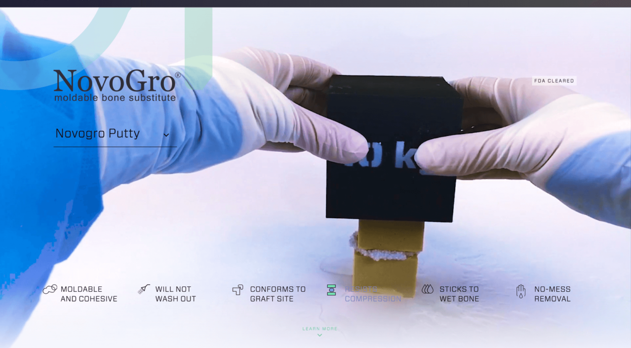
Ostenovus wanted to introduce their new product line of bone regenerating putties with a quick, but informative interactive experience. We achieved this by shooting demonstration videos that show how strong and versatile the products are under several common surgical procedures. We also provided users with a way to examine how the product affects bone growth over time, at several magnification levels.
Read More ›
Novartis Flucelvax Parallax Site Design
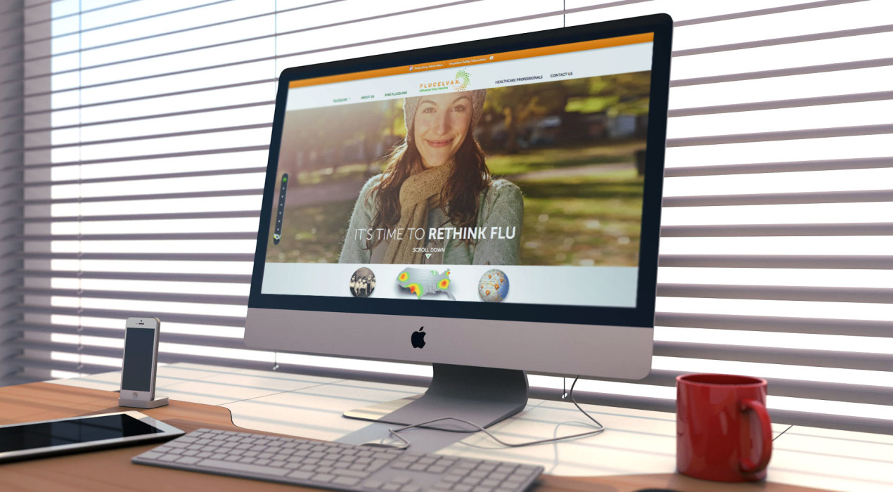
Novartis was seeking a way to educate the public about their advancements in flu vaccine technology. They developed Flucelvax, the first anti-biotic free, cell culture vaccine of its kind. I helped envision Flucelvax’s web presence, and created a parallax home page experience that quickly tells the story of the brand. The story is punctuated by the world’s first socially enabled flu tracker, which gathers Twitter data and parses it to predict localized flu outbreaks. I also designed the site’s interactive timeline that leads the users through the history of influenza and the flu vaccine.
Read More ›
Why Digital Guardian? Video Storyboard
Digital Guardian was in need of a tool to educate their customers about their brand reinvention and how its endpoint security technology is the best way to protect sensitive data. I helped ideate the initial concept and designed a storyboard for the video, utilizing the new site aesthetics and a flat, icon-based approach.
Read More ›
