

Shorelight University Portal Application
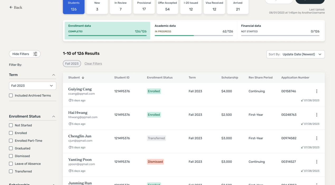
Shorelight partners with U.S. universities to create programs that support international students, providing services to help them succeed academically and advance in their careers. A significant challenge we had with our university partnerships was maintaining data integrity — universities needed clear visibility into how well prospective students were progressing toward meeting U.S. enrollment requirements, while Shorelight required accurate tracking of each student’s academic progress post-enrollment. Shorelight’s financial success is tied to students’ academic progress, therefore accurate tracking is crucial for proper billing. Another major data challenge Shorelight encountered was ensuring the integrity of university program information. With over a hundred partner universities, each offering multiple degree levels and unique program requirements, costs, deadlines, and other details, it was challenging to keep university program data consistently aligned with Shorelight’s records. This often led to discrepancies on the consumer side, where students sometimes received inaccurate or conflicting information about a program they were interested in. When I joined Shorelight, I was focused on designing interfaces for our students and education agents and hadn’t yet had the chance to work directly with our university partners. This presented an exciting challenge—a chance to design for a new audience while tackling these important issues for […]
Read More ›

MIT CSAIL Website UX
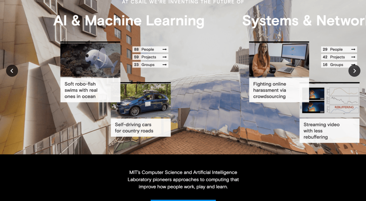
At CSAIL (MIT’s Computer Science and Artificial Intelligence Laboratory), students were having difficulty locating the professors they wanted to work with, or the groups and projects they wanted to join. There was no easy way to sort through the different categories of interests and impact areas on the old site, and most of the detailed CSAIL information was interspersed among several external research group websites. The old site also didn’t demonstrate the culture interconnectivity at CSAIL, and it didn’t effectively educate users about the organization. We conducted user interviews with students and professors, asking about the general pain points throughout the site and in the CSAIL application process. We also examined site analytics to see where users were going and where they were dropping off. We used this combined data to restructure the site, introduce connectivity and add more useful information for the CSAIL student. We created a system to organize all of CSAIL (people, research projects, research groups, news and events) and allow a user to find things relevant to their area of study. Profile pages for each person, group and project have information that shows how all of CSAIL is connected. We also created a section that explains […]
Read More ›
Road Scholar Home Page Redesign
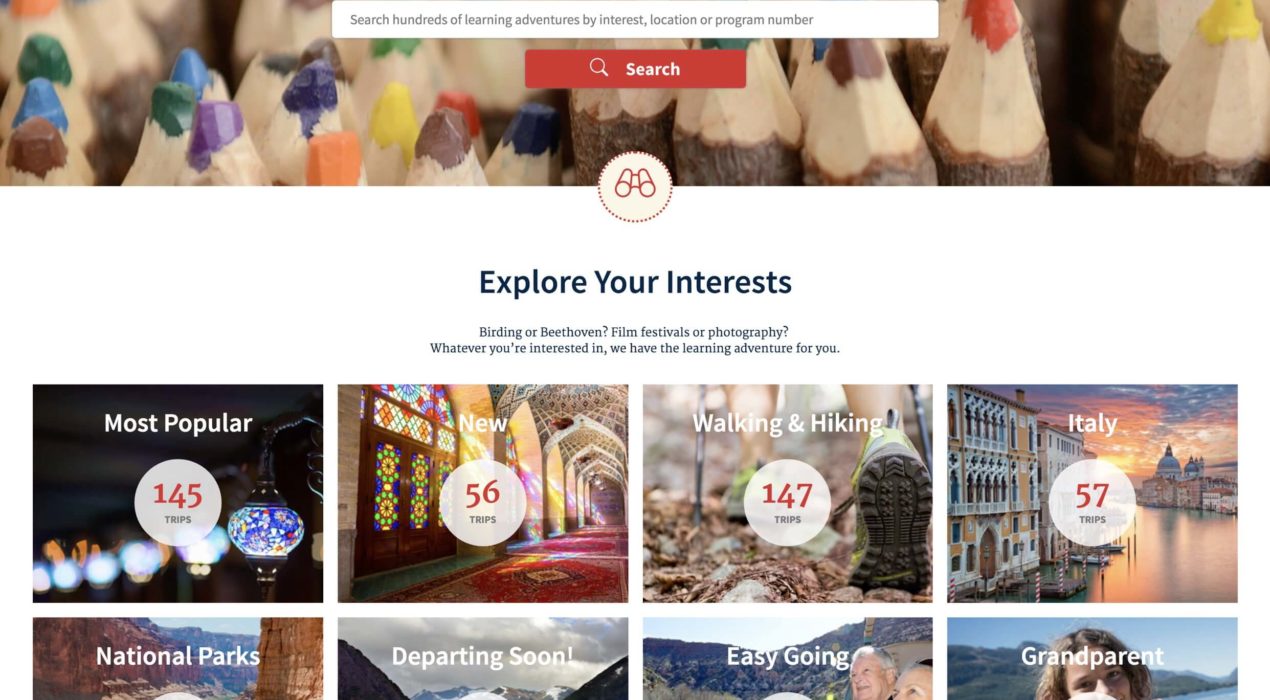
Road Scholar noticed that their home page user engagement was dropping off over time, causing sales to decline. They asked the Moth team to help remedy this dire situation. Using heatmap data and site analytics, we constructed some content strategies to rearrange the home page and add more relevant user content to it. Using elements from their design system, we restructured the home page so that more browsable components were brought higher up in the experience. We also introduced some entry points to their travel blog and other frequently generated content. The order of the page elements varies based on the user’s data, surfacing more relevant content for that person. Immediately after our efforts were implemented, Road Scholar’s site engagement took off, and sales increased dramatically. Original Home Page Updated Home Page
Read More ›
Osteonovus Website: Design & Development
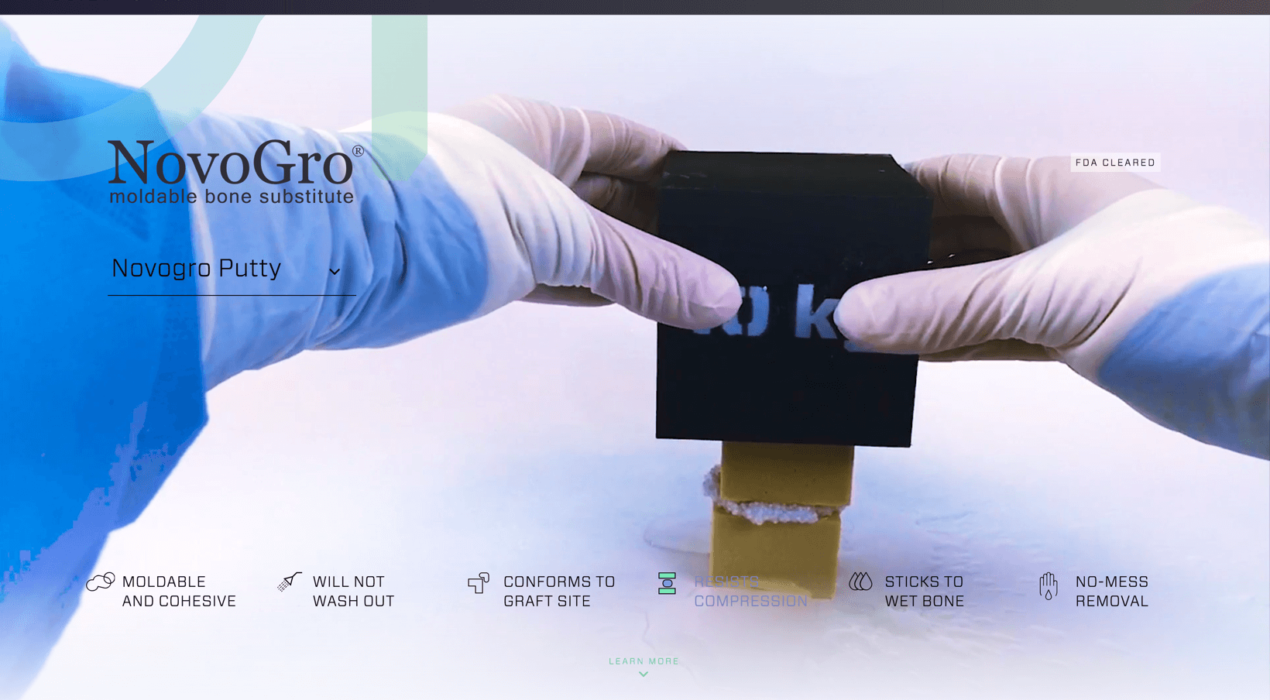
Ostenovus wanted to introduce their new product line of bone regenerating putties with a quick, but informative interactive experience. We achieved this by shooting demonstration videos that show how strong and versatile the products are under several common surgical procedures. We also provided users with a way to examine how the product affects bone growth over time, at several magnification levels.
Read More ›
Vistaprint Interactive Kiosk
As art director at Vistaprint, I was tasked with envisioning the design for an interactive welcome kiosk. The kiosk serves as a fun educational tool that allows employees and visitors to access information and announcements, and is a unique opportunity to immerse the user in Vistaprint company culture.
Read More ›
